Some are fundamentally self-explanatory - having a good understanding of what all icons relate to will allow efficient navigation and content management.
Across different buttons there are a number of repeating symbols to indicate what the command is:
 The Plus sign indicates that the button is an add action and will progress through to a new screen to create new information

A Tick beside a button indicates a confirmation; a new pop-up window will display to confirm the action

A solid down arrow on a button indicates that there are more menu items available

Hollow up/down arrows allow a section to be expanded or collapsed
 |
Bell IconThe bell icon will have a number showing on it to show how many notifications you have. These will be notifications about important functionality such as: |
|
Toolbar Commands
These buttons are found in the Toolbar and are generic across multiple screens. Buttons lead to new actions and views. Button text is either grey or white:

Grey text
The button is inactive and there is insufficient information to proceed with the action.

White text
The action can be completed as the required information has been updated.

Red Button
There is insufficient information on the form. Incomplete fields are coloured red and must be filled in before the button is available to use.
Other buttons

Back
Back to the previous screen.

+Add
Add a new record.

Edit
Shift the record mode from View mode to Edit mode to allow changes to be made.

Save
Save the updates to the current record or transaction.
The Save button displays with a red background if the record or transaction is incomplete and not ready to save.

Post
Process the transaction being worked on.

...More Options
Provides further options and commands.
Reports and previews can also be accessed from here.

Enquiry
Look into a record or transaction for further information.
Tabs and rows within an Enquiry can be further drilled into.
General Icons and Buttons
Buttons and icons are found within rows, forms and the general activity area. As with Toolbar commands, they allow new actions and views. Buttons in the body of the activity area relate to individual records or transactions. These include:

Edit Pencil
At the end of a row, opens the record to allow editing.

Spill menu / Ellipses
At the end of a row, opens new menus to allow further actions against a specific record.
Menus vary depending on the record or transaction type.
![]()
Move Icon
This allows an account / record to be dragged and dropped to another location.

Toggle Sliders
Slide to respond. In some screens the result of selecting the button will be that new fields will display.

Tabs
In records with extensive information, Tabs are used to gather together related data. The highlighted tab is the active tab.

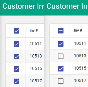
Select multiple rows
Use the checkbox option at the start of rows to select them. Use the Select All option at the top of this column to select / deselect all records displayed on the screen. If all records are required - not just those on display - use the menus available under ...More Options.
Paperclip
Indicates that there are files attached

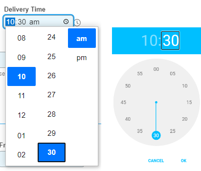
Time fields
Digital and analogue options are available to set a time. Use the clock icon within the field to open the clock, and the icon beside the field to choose the clock mode.
 |
DownloadIndicates that the files can be downloaded |
 |
DeleteIndicates that the highlighted item can be deleted |
For more information about keyboard shortcuts and navigating fields, follow this link.

