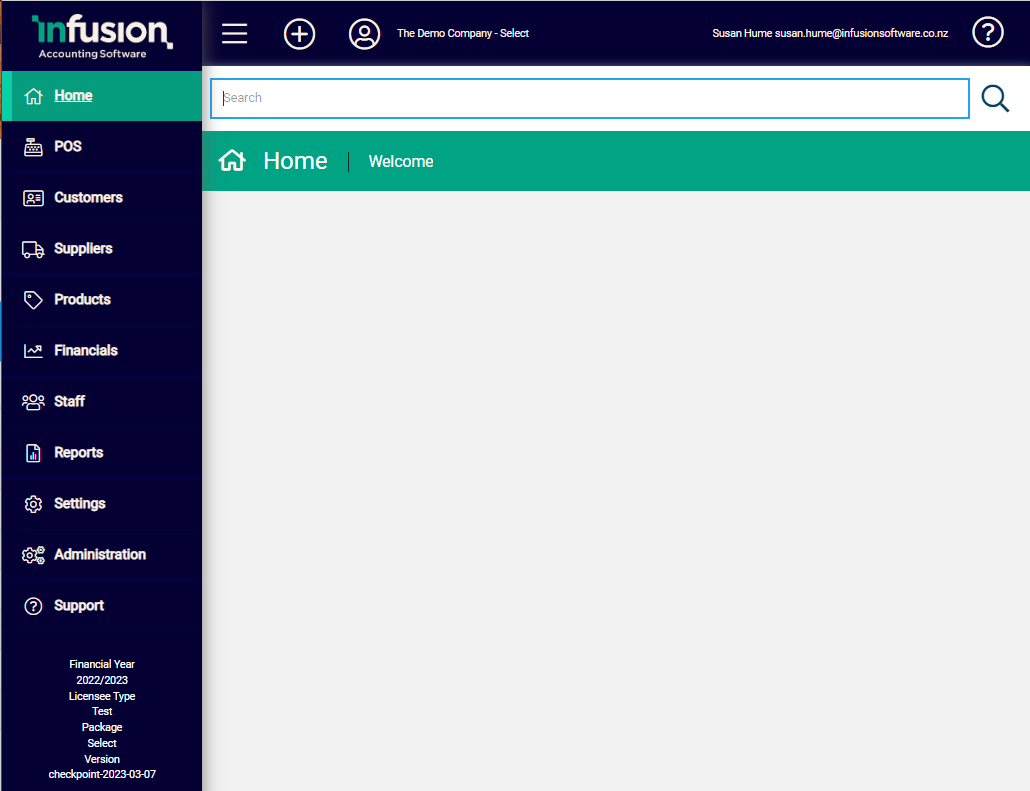
Screens within Infusion follow a common layout and are uniform throughout, allowing easy navigation and access.

The layout is made up of four main areas, each with their unique purpose.
Main Menu
The Main Menu runs down the left-hand side of the screen and allows immediate access to the different modules within the software. It is static on the screen and always available even when scrolling within the Activity Area.

Modules
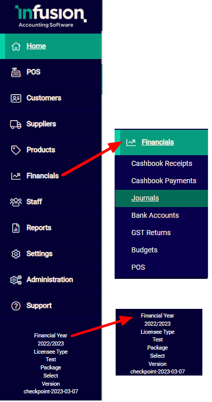
Available modules are displayed in the main menu. As these are accessed the sub-categories expand. The active module is highlighted and within the module the active sub-menu is further emphasised with an underline and highlighting.
The Main Menu can be a useful reference point as records and transactions are not always accessed via it, yet it will still indicate where the user is located within the software.
Version
The financial year and database version are displayed at the bottom of the menu. When updates are applied to the server users receive an email detailing changes.
Header
The Header provides both database information (identifying which database is active and the currently logged in user) as well as providing command buttons for navigation and display.


Hide / Expand button
The Main Menu on the left-hand side of the screen can be collapsed or displayed by toggling this option. Hiding the menu is particularly beneficial on smaller screens so as to maximise the available space for displaying information.

Omni icon
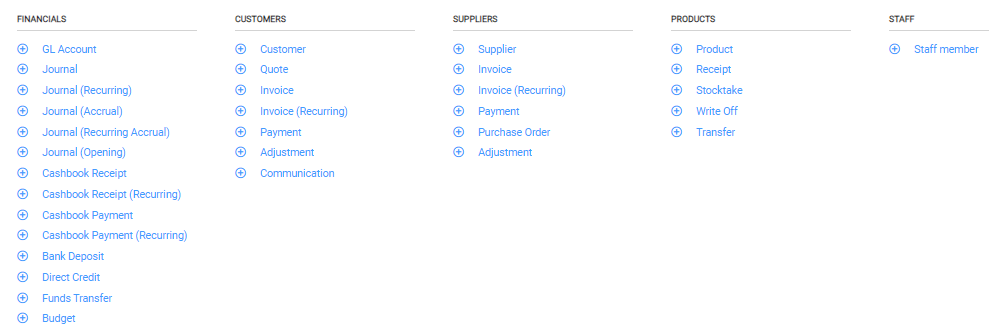
Use the Omni icon to quickly action a number of Add functions. It is available as an alternate option for adding records and transactions while the Main Menu is hidden, regardless of which screen is active.


Profile
The Profile option allows editing of the security settings (reset password, activate two-factor authentication) of a user’s profile. It also allows easy movement between multiple databases if they are available.
The current database displays alongside the Profile button and the active user account displays on the far right of the header.

Logout
The logout option allows the user to logout from the session
Toolbar
The Toolbar sits below the search bar and displays the name of the active menu or record e.g. General Ledger. The toolbar is dynamic and populates with new icons and command options depending on the screen or record that is open.

It is a central location for information, actions and navigation, and a focal point for moving through screens and records.
Activity Area
The Activity Area is the main part of the screen where information displays and is worked on. When there are long lists the Activity Area scrolls while the menu and toolbars around it remain static.

When records are displayed as a list, data in a number of the columns can be sorted via the column headers. Where this can be done, an up arrow will display next to the header title when hovered over.

Rows can be drilled into to access records. Clicking directly into a row opens a record in view mode; using the icons at the end of the row opens it in edit mode.

