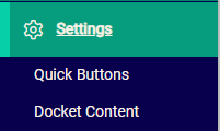
To customise your Quick Buttons, go to POS > Settings > Quick Buttons.
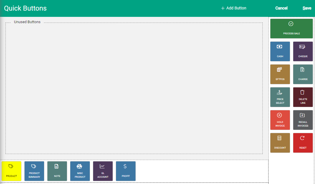
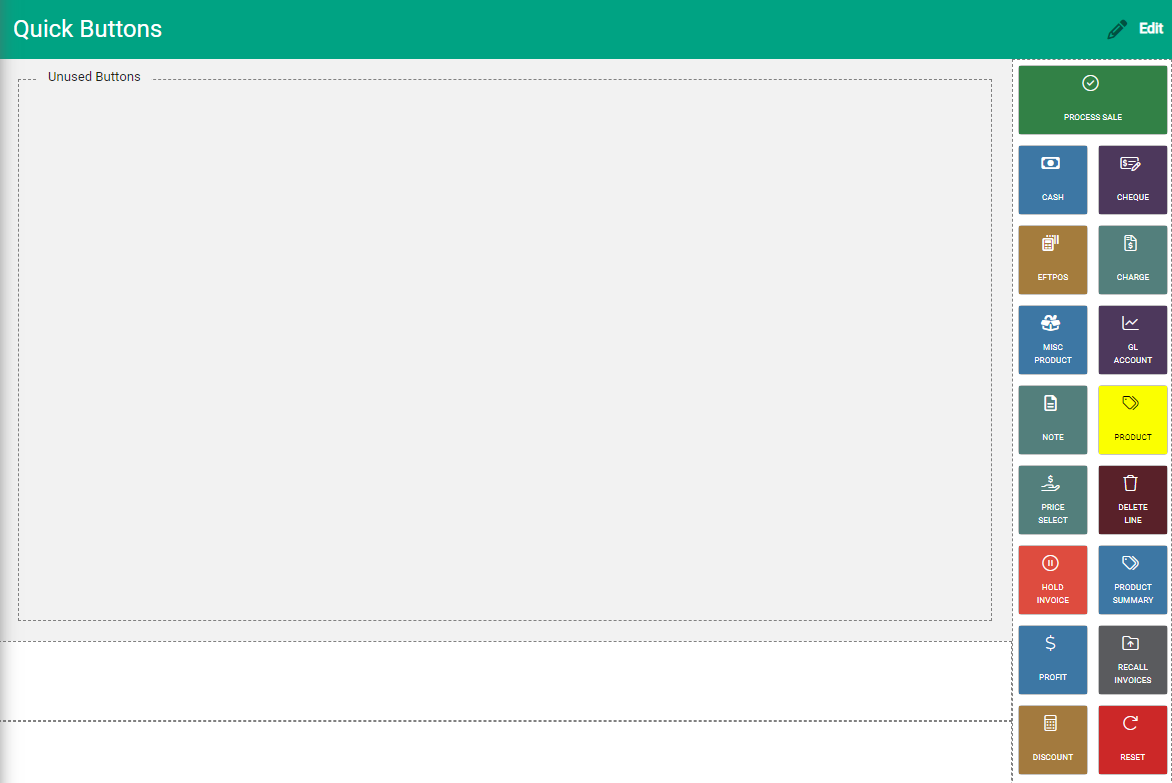
The Quick Buttons window opens. The display shows you exactly how your buttons will appear in POS Entry. Quick Buttons display, with sections at the bottom of the screen and on the right, as well as an Unused Buttons area in the main display.
There are three types of Quick Buttons:
- Payment method: Available for each payment method type that you offer, with the exception of Direct to Bank
- Product: Directly add a product to the sale without having to search in the product field
- Product Lookup: Access products associated with the product classification (eg. Product Type)
Add quick buttons
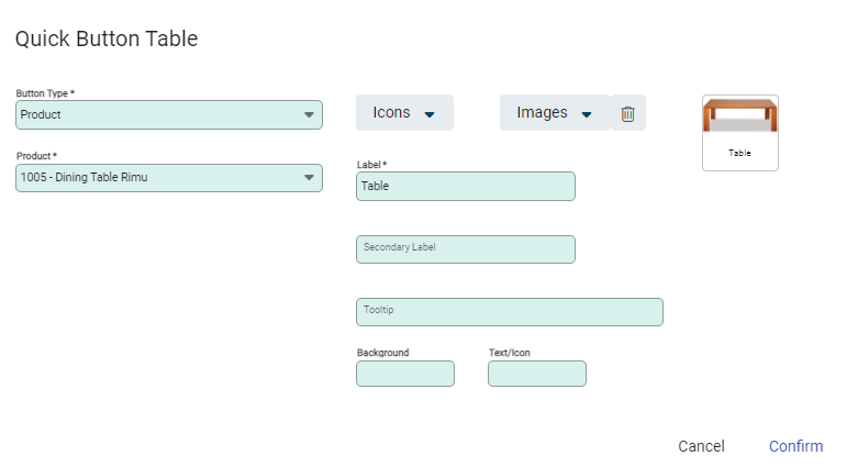
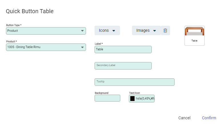
To add a Quick Button, select Edit, and then select + Add Button from the toolbar. The Quick Button window opens. As you complete the fields, the sample button on the top right will show you the button's appearance.
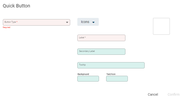
Select the Button Type
When you select a Button Type, new fields will appear related to the type you've chosen. The Button Types are:
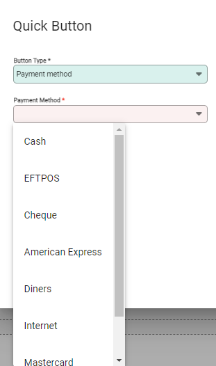
- Payment method: Choose the payment method from those available in Settings.
- Product: Choose a product from your list of Products
- Product Lookup: Choose the range of Products based on Type, Group, and Sub Group
Adjust the appearance of the Quick Button
You have the option of choosing an icon or an image to display on the button. Search for an icon in the library using key words that relate to the Button Type. You can select an image if you have images saved in the Documents tab within a Product.

Other visual settings you can adjust include:
- Background: Choose the background colour of the button (unless you have added an image)
- Text/Icon: Choose the colour of the text and icon
Labels and Tooltip
The labels and tooltip fields enable you to add useful information for users of the POS screen.
- Label: Add a label to the Button (10 characters max)
- Secondary Label: Add another label that will appear underneath the first (10 characters max)
- Tooltip: Add a message that will display when users hover over the button (250 characters max)
When all elements are added select Confirm.
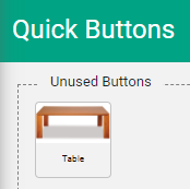
The button displays in the Unused Buttons field.
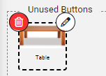
Edit or Move Quick Buttons
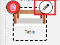
To make changes to a Quick Button select Edit from the toolbar. Hovering over the buttons shows the edit pencil, and the cursor changes to arrows to show that it is available to move.
Move a Quick Button
Hover over the button then click and drag to the required section. This is either at the bottom of the screen or to the right. Release when the button is in place.
Select Save to complete.
Change Quick Button Elements
Click on the pencil icon to open the Quick Button window. Make changes to any of the elements and Confirm.


After moving or editing the icon, return to the toolbar and select Save to complete.
Unused Quick Buttons
Quick Buttons stored in the Unused Buttons section do not display on the POS Entry screen.
If it is not removed from the side bar in the Quick Button settings, the button shows as faded on the POS Entry screen, and is unavailable to use. Unused Quick Buttons can be moved between sections at any time, and re-displayed on the POS Entry screen.
Customise the placement of Quick Buttons
You can choose to arrange your Quick Buttons as required. For example, you can have the payment buttons on the right of the screen and the product buttons along the lower section.